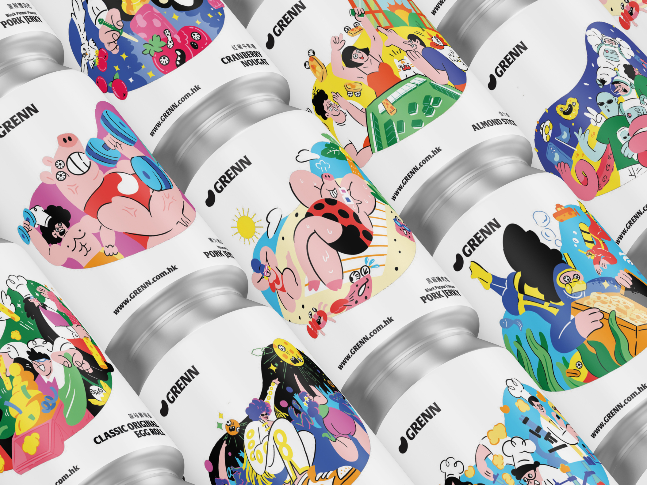
A rebrand for a local bakery, "thebakery," transforming its classic palmer cookie into a modern snack brand, "Grenn," by using a fun, youth-focused design and a unique time capsule-shaped metallic can packaging.
The local bakery "thebakery" faces a common challenge: their bestseller, the palmer cookie, primarily attracts an older, established audience. While the product is high-quality and beloved, the current branding and packaging are perceived as traditional and fail to resonate with a younger demographic. To ensure long-term growth and market relevance, the bakery recognized the need for a complete repositioning. The goal is to evolve from a classic bakery item into a vibrant, modern snack brand that captures the attention and loyalty of a new, younger audience. This repositioning includes a new name, "Grenn," to streamline trade name registration and create a fresh, distinct identity.



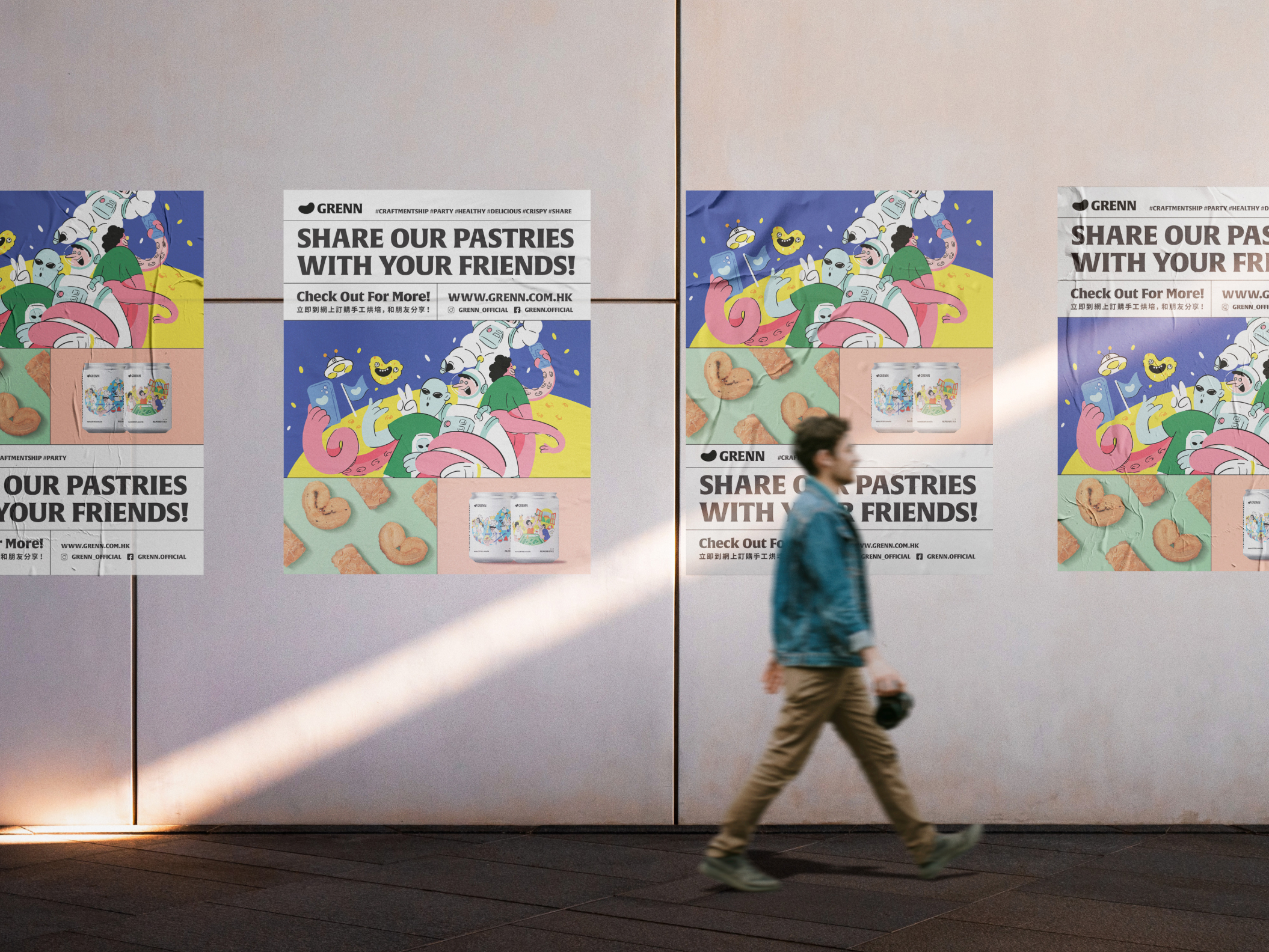
Our solution addresses the core challenge by leveraging three key elements: a new brand name, innovative packaging, and playful visual branding.
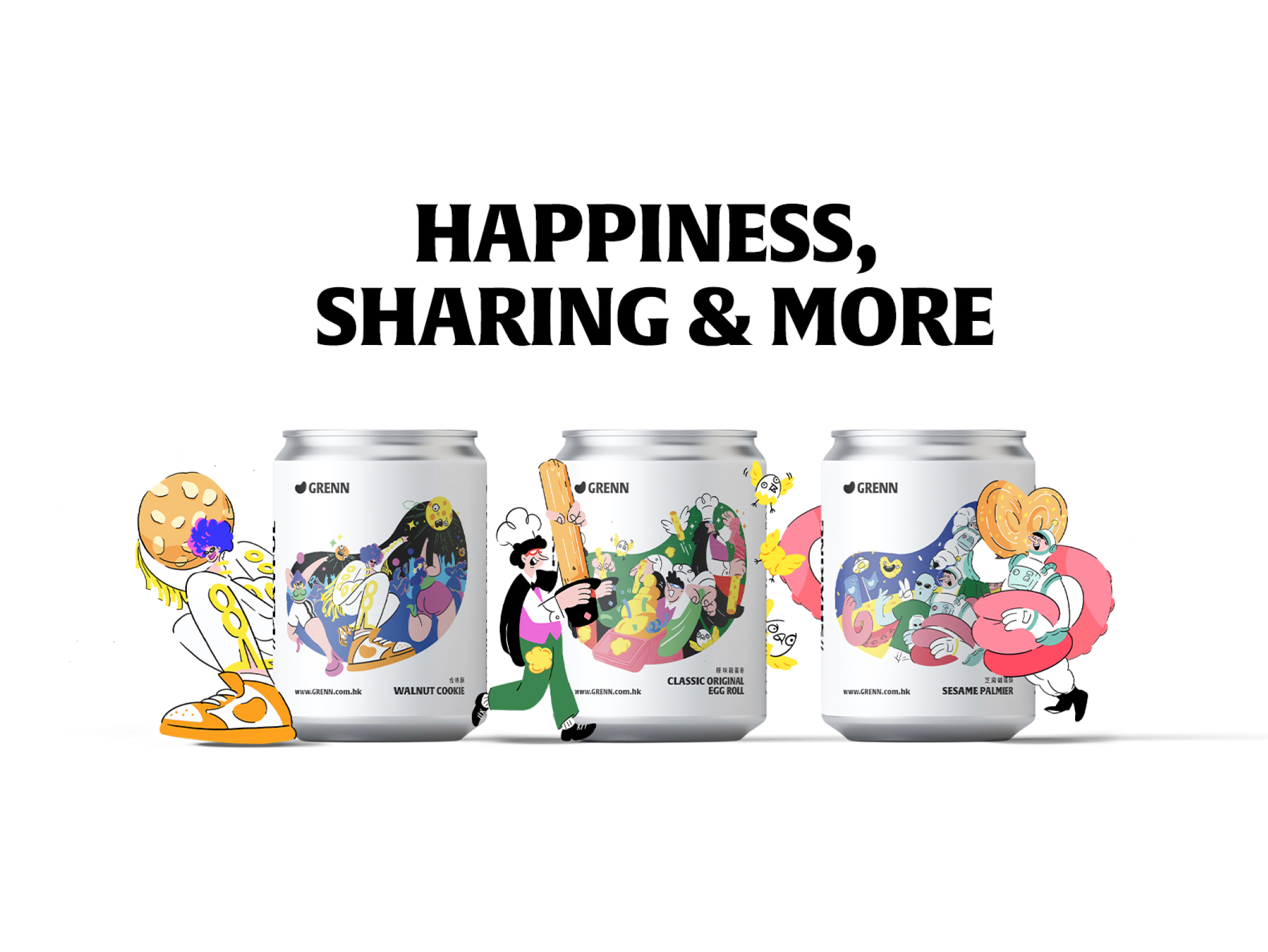
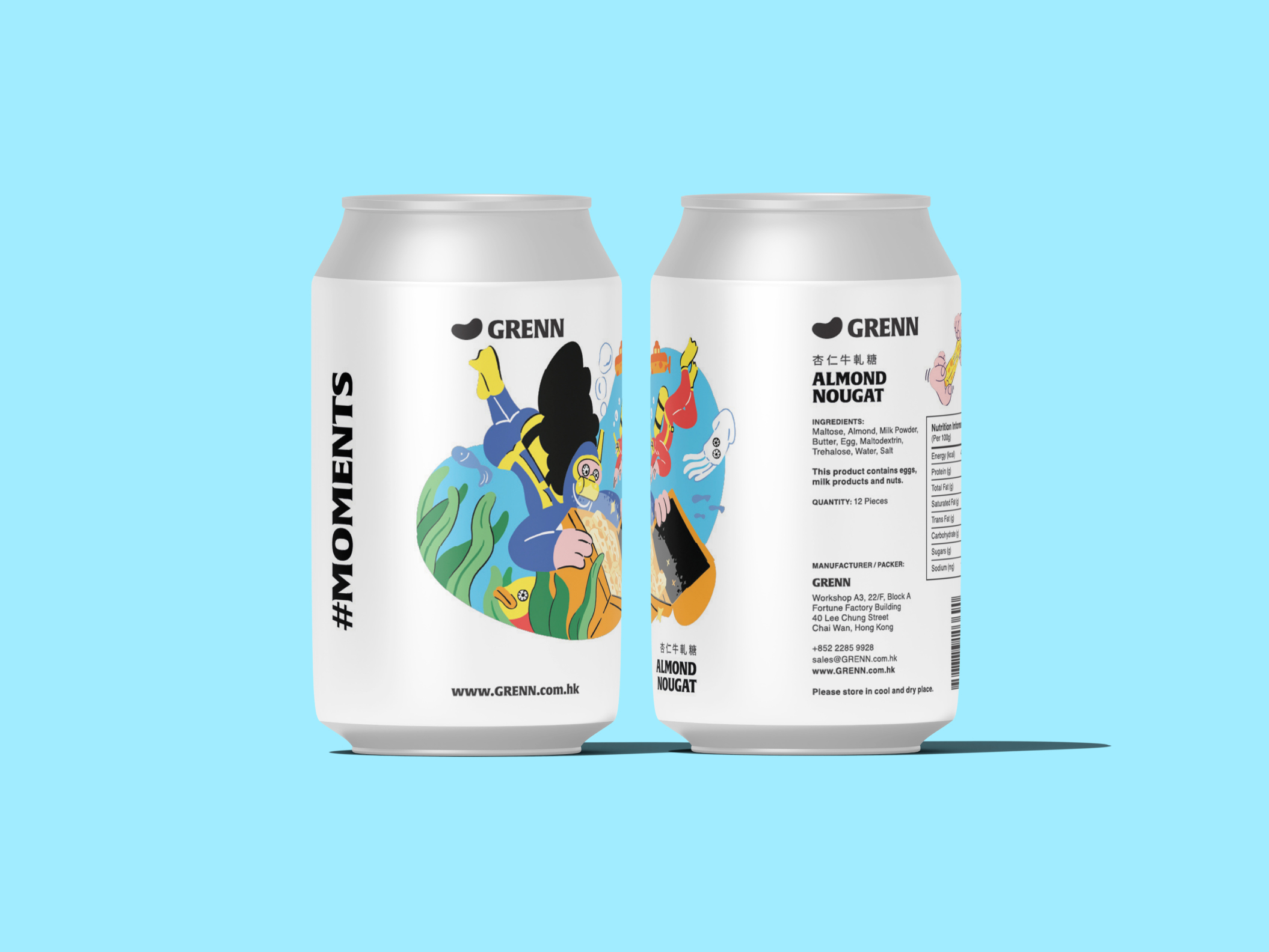
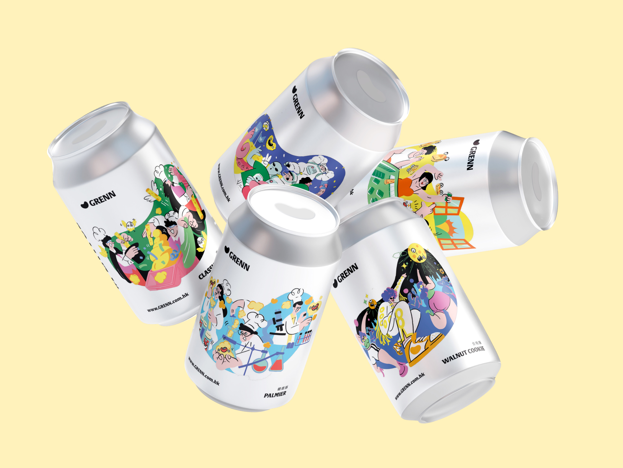
Innovative Packaging: We created a distinctive metallic can packaging that combines the iconic shape of a soda pop can with the conceptual design of a time capsule. This unique shape is both familiar and novel. The hermetically sealed can ensures the palmer cookies remain perfectly fresh and intact, preventing breakage—a common issue with traditional packaging. This durability is a key selling point for a portable, on-the-go snack. The can's pop-top opening, and the satisfying audible crunch of the cookie inside, links the packaging to the product's quality, creating a multi-sensory experience that appeals to a younger audience.
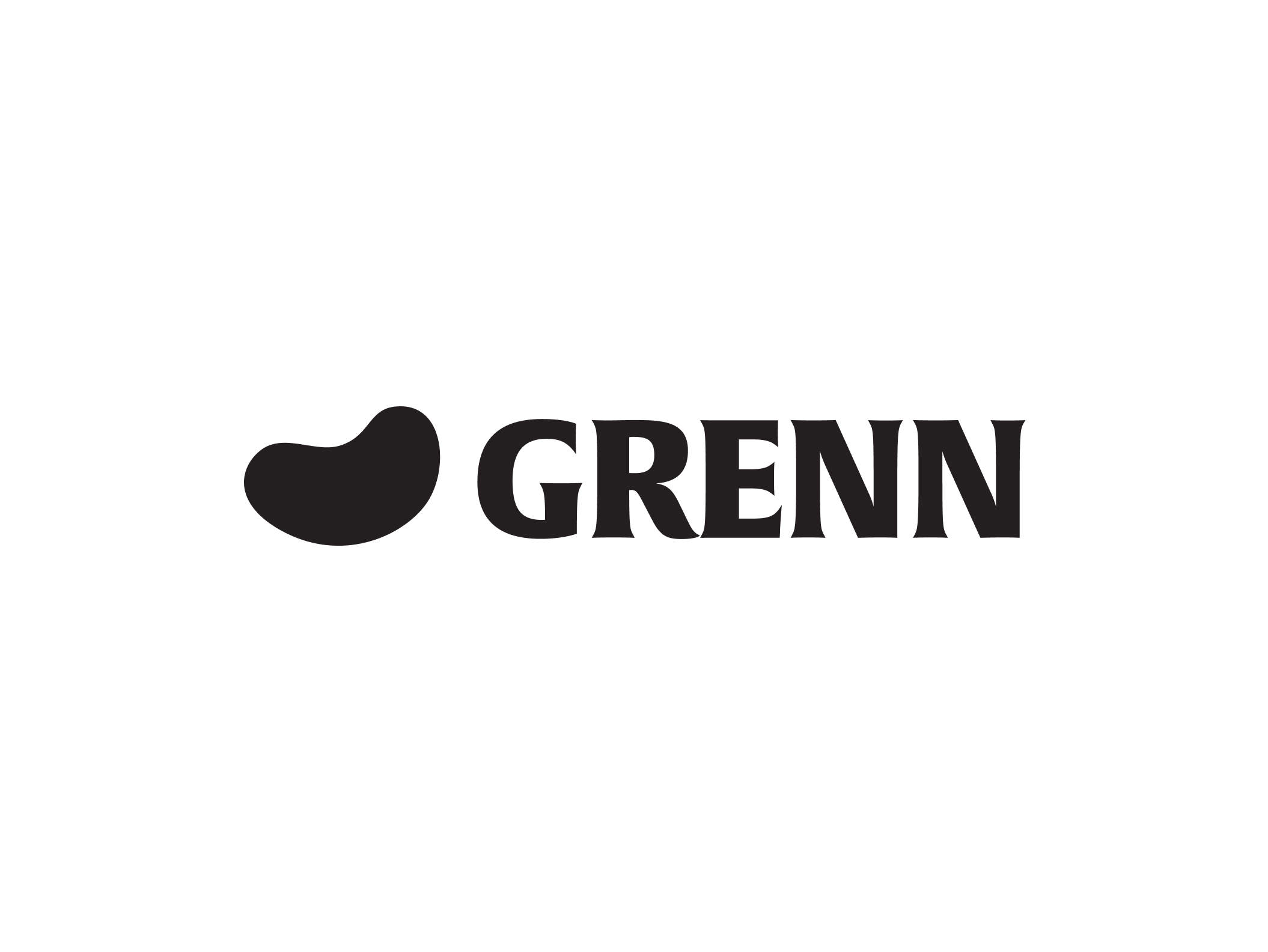
Playful Visual Branding: The new brand, "Grenn," is brought to life with a logo that combines a big, friendly smile with a palmer cookie to convey happiness and a delightful snacking experience. The packaging features a series of playful, whimsical illustrations that tell a story. This visual language replaces the bakery's traditional aesthetic, making the product look inviting, fun, and shareable on social media.
Strategic Repositioning: By using the can's shape, we position "Grenn" not just as a cookie but as an iconic, collectible snack. The reusable nature of the can gives the packaging a "second life" as a pen holder, coin bank, or small container, which aligns with modern consumer values of sustainability and practicality. This holistic approach transforms the brand from an old-fashioned bakery item into a modern, iconic brand that is relevant and appealing to a new generation.
